
Enhancing data discoverability within the Shipping Dashboard to enhance the daily productivity of Warehouse Area Supervisors
My Roles -
🎨 UX Design Intern
📜 Data-Storytelling Design Guideline
🔍 Card-Sorting Research
For -
Honeywell Connected Enterprise
Honeywell Performance +
With -
UX Researchers,
Product Manager
Duration -

overview.
Persona-based redesign of a key warehouse monitoring dashboard
Warehouse managers need real-time visibility of the warehouse operations and an easier way for decision-making. Honeywell Forge P+ is a B2B SaaS platform designed for clients to better monitor and operate their warehouses.
However, with a surplus of KPIs in P+, it’s hard for specific roles to quickly identify the metrics and insights they care about or smoothly take follow-up actions. Our redesign efforts of the dashboard focuses on 1 dashboard most commonly used by Area Supervisors to increase their productivity and empower decision-making in their daily work.
My role.
Co-leading research and delivering the strategic redesign
I led the end-to-end redesign efforts by closely collaborating with UX researchers, including:
Co-led user research, including surveys, user interviews, card-sorting activities to uncover target users’ mental models, and prioritize the user needs.
Redesigned the information architecture and user flow for Area Supervisors to improve their data-driven decision-making efficiency.
Delivered the end-to-end design artifacts through review sessions, user tests, and iterations.
Created a data storytelling framework to scaffold the dashboard design process, enhancing design efficacy and facilitating cross-team communication.
Key abilities:
UX Strategy
Collaborative Research
Data Storytelling
Design Guideline
Context.
Honeywell Forge Performance+
The Honeywell Performance+ (P+) platform is a B2B SaaS solution tailored to support industrial end-users in achieving digital transformation and optimizing operational efficiency. For example, the Operation platform within P+, offers various dashboards to provide real-time visibility into warehouse and distribution center operations. This empowers managers to make informed decisions and drive intelligent operations.
Who are we designing for? What's Shipping Dashboard?
The Warehouse Area Supervisor is a managerial position tasked with overseeing daily operations within their designated warehouse area. One of their daily responsibilities is to ensure the timely and accurate shipments of goods.
The Shipping Dashboard within P+ Operation Platform was designed to help them easily oversee the shipping operations within their managed area, make informed decisions, and thus enhance their day-to-day productivity.
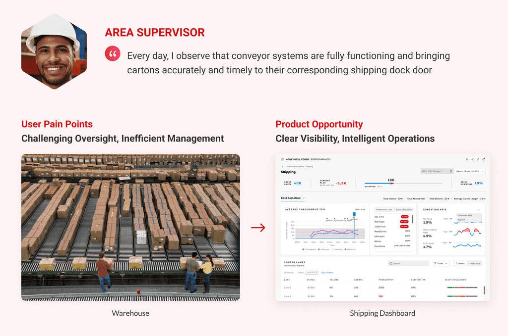
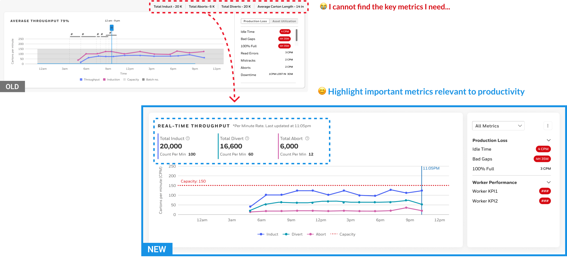
Problem.
Surplus KPIs, Poor Discoverability in Shipping Dashboard
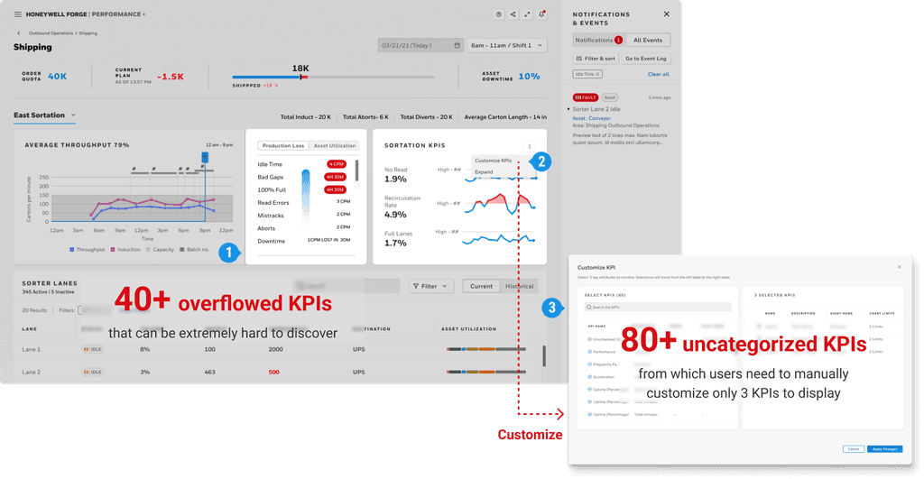
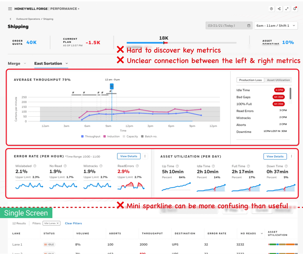
Original Shipping Dashboard
Yet, lacking domain knowledge about Area Supervisors, including their goals, required KPIs, and utilization in daily operations, we faced challenges in effectively displaying KPIs to enhance productivity in shipping management.
Project goal.
We need to tailor the Shipping Dashboard to help Area Supervisors effectively absorb information they need and enhance their productivity regarding shipping management.
Research overview.
3 questions to uncover Area Supervisors' mental model
Q1: What operational challenges do Area Supervisors want to solve?
Q2: What metrics do Area Supervisors need to address above operational challenges?
Q3: How do Area Supervisors want to consume these metrics?
I co-led the following research activities with user researchers to answer the questions above.

surveys.
Q1: What operational challenges do Area Supervisors want to solve?
👉 We conducted surveys to pinpoint the most pressing challenges that AS aim to address, and the metrics that matter the most.
Surveys helped us collect quantitative information about Area Supervisors and understand their common demographic information, work responsibilities, challenges they faced, and the metrics that they want to see in real time. We successfully collected 24 responses.
Survey Insights.
💡 “Managing a wide variety of assets and shipment to ensure timely shipping” is the most pressing challenges for AS
Through quantitative analysis, we generated the persona of AS to help us understand their roles, goals, etc. Based on which we also prioritized the most important goal and the most severe challenge for AS, and narrowed down our redesign focus for the P+ Shipping Dashboard.
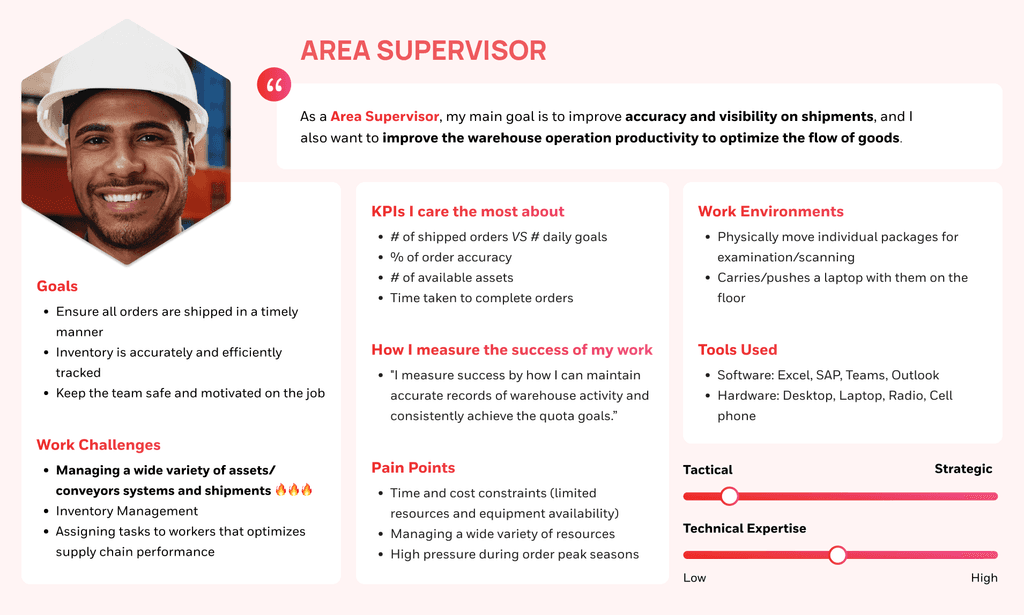
Persona of Area Supervisor
refined Design goal.
Based on quantitative results, we refined our goal for the redesign efforts:
How might we utilize the shipping dashboard to support Area Supervisors in managing a wide variety of assets and shipment to ensure timely shipping?
card-sorting & User Interviews.
Q2: What metrics do Area Supervisors need to address above operational challenges?
Q3: How do Area Supervisors want to consume these metrics?
👉 I co-led the card-sorting activity and user interviews to uncover AS’ mental models and requirements for metric consumption.
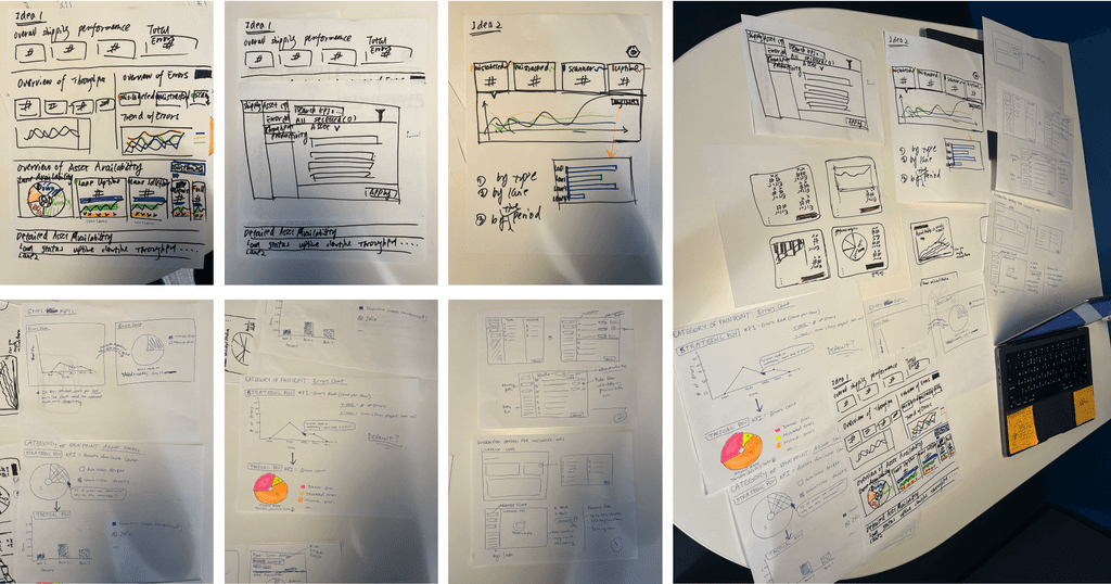
To uncover the questions one by one, I closely collaborated with the UX researchers to design the special card-sorting activity, which is comprised of three steps, shown in the online template below.
Please zoom in to walk through this fun activity!
Synthesis.
Q4: With such a wealth of information, how can we synthesize it to effectively inform design decisions?
💡 I built a framework for data storytelling analysis to scaffold the research synthesis process and guide design decisions that align well with user requirements
Since we have a lot of multi-media information collected from card-sorting and user interviews, synthesizing it effectively and accurately to inform the design process was a big challenge. Thus, after trials, I built the following framework to help scaffold the synthesis process and aid in dashboard design choices that accurately reflects user requirements. Please zoom in ; D
Design Principles.
I investigated existing dashboard design practices to generate our own design principles
To better inform our redesign decisions, I researched existing guidelines, white papers, and products related to dashboard design, based on which I created our design principles.


team co-design.
Our UX team brainstormed possible redesign options for clarifying the redesign scope & prioritizations
With the synthesis results and the design principles presented to the UX team, we brainstormed together on possible redesign solutions. This co-design activity helped me quickly and effectively understand existing design constraints or patterns within the product ecosystem from senior designers and researchers.

Data Storytelling flow.
💡 I composed a new info architecture and user flow centered around AS’ mental model and goals
On the spacial dimension, I displayed the information based on their importance for AS as well as their affinity, so that AS can identify information they need at a quick glance.
On the temporal dimension, I designed intuitive interactions for users to zoom and filter to get more detailed information they need.
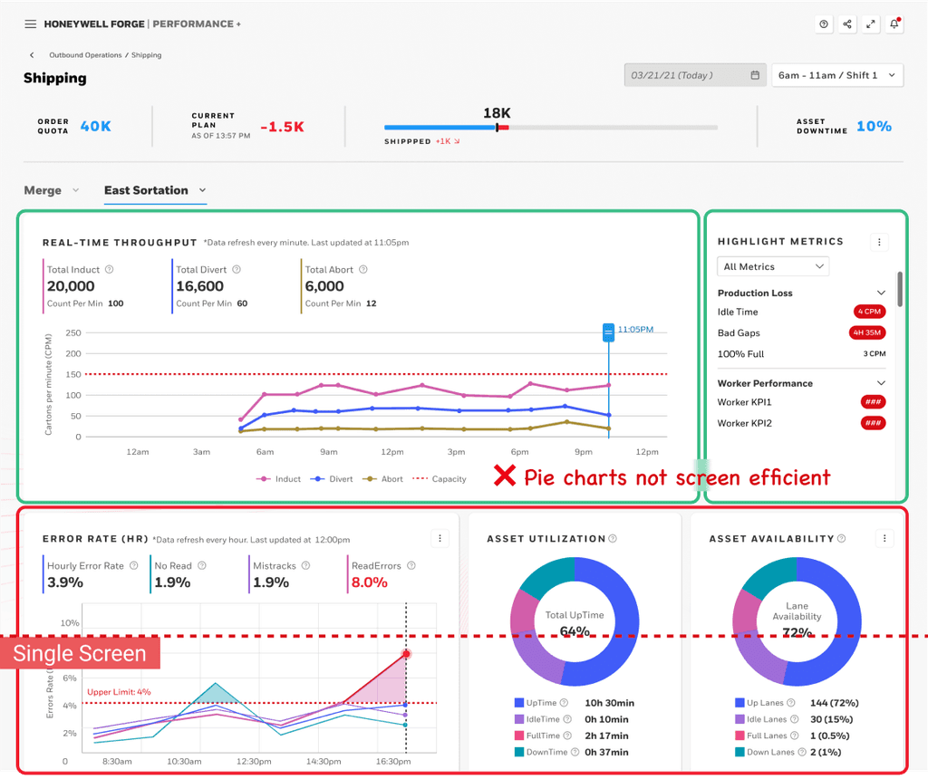
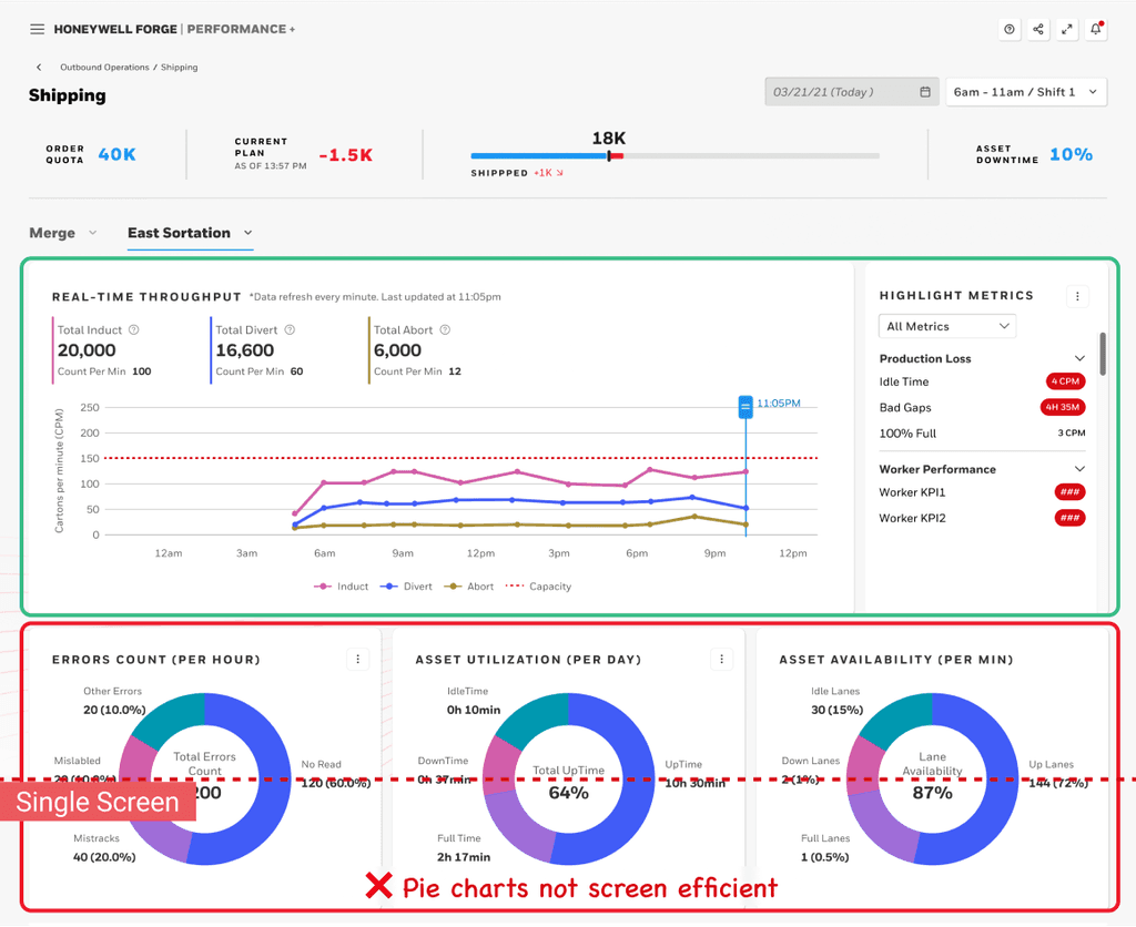
design explorations.
Review sessions with UXRs/PMs/Senior Designers to choose the most feasible and effective solution
To take implementation feasibility, design consistency with the entire ecosystem, and the user experience benefits into consideration, I organized design concept review sessions and iterated my design based on stakeholders' feedback.
OVERVIEW.
⛑ As an Area Supervisor, take a quick glance at the dashboard overview

throughput.
📈 Track throughput productivity. Is it too slow?
error rate.
🚨 Monitor error rates. Do any errors exceed the upper limits?
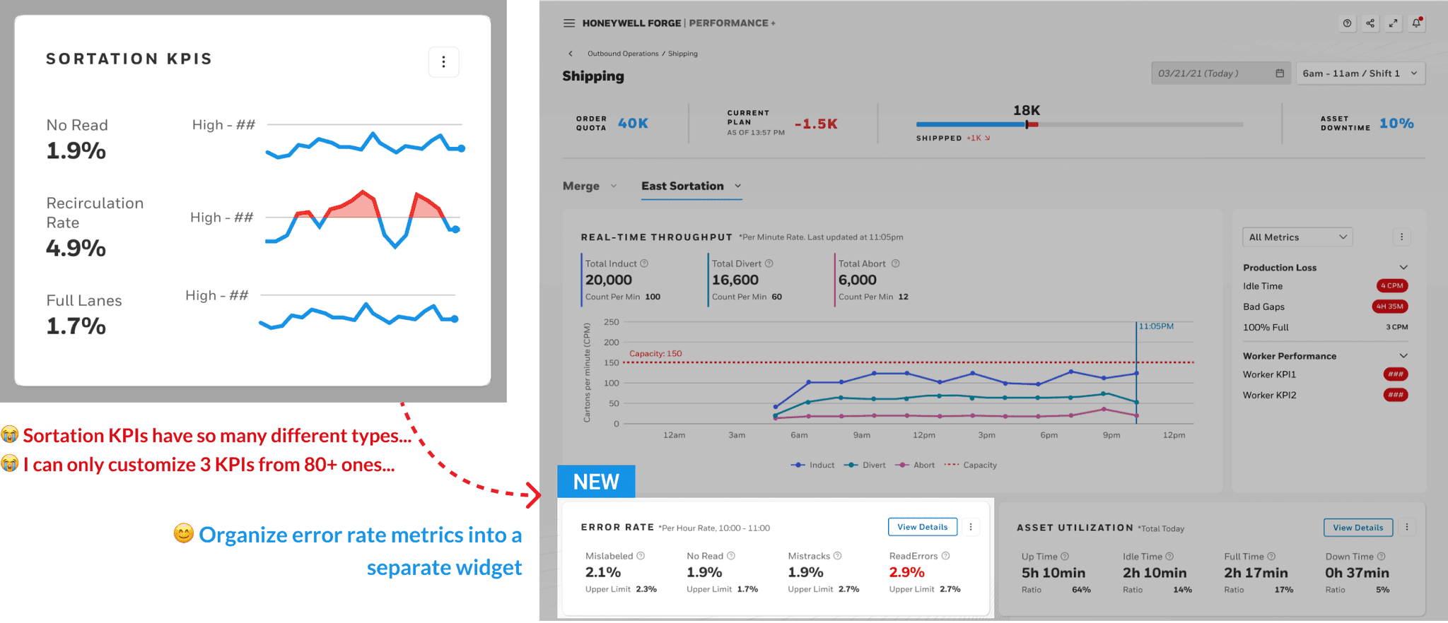
error rate.
🐛 Find the cause: When did it happen? Which asset was it?

Asset utilization.
⏰ Are assets utilized productively? Can we improve it?

Asset utilization.
🤔 How did the asset performance change? Which lanes can be used more productively?

KPI Customization.
🔍 There are some other metrics I want to look at. Let me customize them myself.

Key iterations.
I am still working on the case study. Check the slides first ; D
Problem context.
I created a data storytelling design guideline to scaffold the design process and facilitate cross-team communication
The framework I developed proved instrumental in guiding both research synthesis and design ideation processes, as well as effectively communicating research insights and design decisions across teams including researchers, PMs, and engineers. Building upon this success, I refined the framework into a "data storytelling design guideline" comprising both analysis and design components. This guideline serves to support the UX team in tackling similar dashboard project requirements with clarity and efficiency.
Design Impact.
Redesigned version improved user satisfaction by 40%.
Currently under implementation.
Our final version improved user satisfaction from 4.5/7.0 to 6.3/7.0 and received warm feedback from the clients.

team contribution.
🙌 My design framework was spoken highly by the UX team
My design process, including the research synthesis part and the ideation part, were spoken highly by the UX team at Honeywell Connected Enterprise. Besides this individual case, my Data Storytelling Guideline also received positive feedback from the UX team for its effectiveness in clearly guiding their design process and sharing research insights & design rationale across different teams.
💗 Recommendation letter from my design mentor
Rob Jones (Senior Designer & My Design Mentor):
What i learned.
🤝 Fostering creative & collaborative research as a designer
Collaborating closely with UX researchers to develop an engaging online card-sorting activity, I've realized the significance of integrating design thinking into the research process itself. By creating digital visual cards and card-sorting templates, I contributed to a more streamlined and engaging research experience and helped us effectively collect insights, highlighting the value of us designers contributing our design skills&creativity throughout the research stage.
💡 Beyond product design - Design the product design process!
Creating the data storytelling design guideline was a highlight of my work. I was thrilled to see how my design process could be adapted to tackle various complex data design problems in similar scenarios. Moving forward, I aim to expand my design thinking to "the design of the design process itself". By collaborating with fellow designers who face similar challenges, I hope to develop effective guidelines that can assist novice designers in making informed & creative design decisions amidst ambiguity and complexity.