
overview.
Ant Group Self-Analytics Platform for diverse internal teams
During my 1-year full-time work experience at Ant Group, Alibaba, I owned the design of various no-code self-analytics tools within AntInsights — a SaaS data analytics & collaboration platform tailored for 20,000+ internal users. These self-analytics tools help diverse internal teams, including Business Intelligence, Marketing, Operation, Business Strategy, etc, to access data and uncover data insights for product promotion, user retention, etc.
Want to learn more about my work experience at Ant Group? Check it out!
My role.
I led the research-driven redesign to enhance learnability
I took the lead in redesigning our self-analytics tools, working closely with product managers, business intelligence specialists, engineers, and design collaborators.
Conducted comprehensive research for the entire product ecosystem and created effective UX strategy.
Organized co-design workshops across multi-functional teams to collaboratively build the product roadmap.
Delivered scalable design solutions and design guide for all the self-analytics tools in the ecosystem.
My design iterations led to the increase in Task Success Rate, rising from 52% to an ideal 100%. Besides, it successfully contributed to increase of user adoption from 5,000+ to 9,000+ within two quarters after launch 🎉.
Key abilities:
Research-driven Redesign
UX Strategy
Systems Thinking
Scalable Design
Accessible Design
Context.
Why do internal employees at Ant Group need self-analytics?
Ant Group is a fintech company founded by Alibaba Group. Ant Group operates Alipay, one of the world's largest digital payment platforms that provides various financial services. Data-driven decision-making plays a pivotal role for internal teams such as Business Strategy, Marketing, Operations, and Product Management to enhance these financial services across various levels.
Previously, these internal teams heavily relied on Business Intelligence (BI) specialists for data access and analysis. Since many of their analysis tasks were common and repetitive, and waiting for BI support could be time-consuming, such reliance not only hindered their efficiency but also distracted BI specialists from tackling more complex tasks.
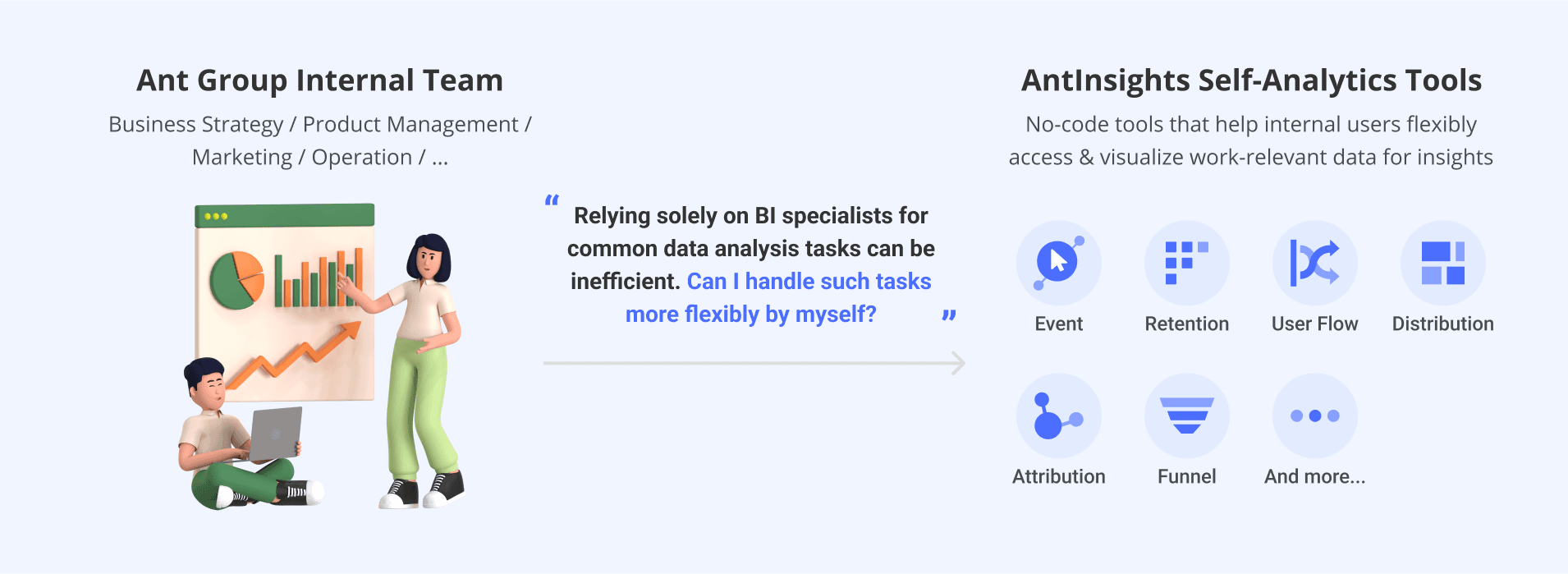
Therefore, several self-analytics tools were provided within AntInsights to help employees easily access and visualize relevant data for insights through simple selects and clicks, instead of requiring assistance from BI.

6 Self-Analytics Tools (Old Version)
Problem.
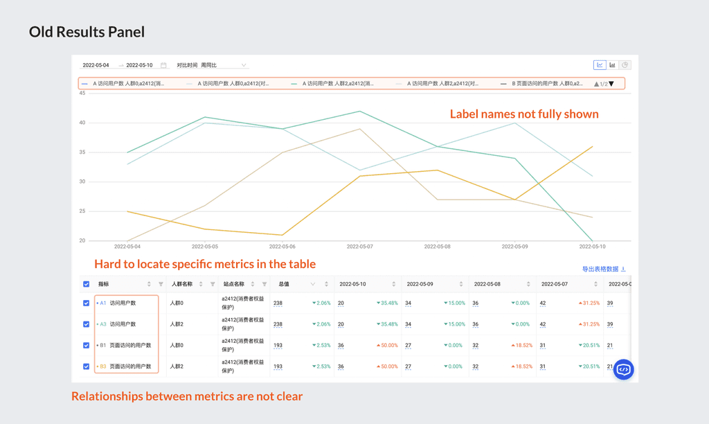
Over 60% abandoned rate for first-time users
Usage data indicated that 60%+ first-time users jumped out of the platform before completing the analysis task. User feedback suggested that novices either needed to check the product help docs to learn the tool, or just gave up as they couldn't see the value of using these self-analytics tools.
Steep learning curve impede "Data newbies" from self-learning
Preliminary user research showed that a large portion of internal operation specialists and marketing specialists, lack data analytics experience or knowledge, would find it too difficult to learn or use the tools by themselves. They ended up seeking manual guidance from BI specialists or just creating tickets for BI specialists to perform the analysis.
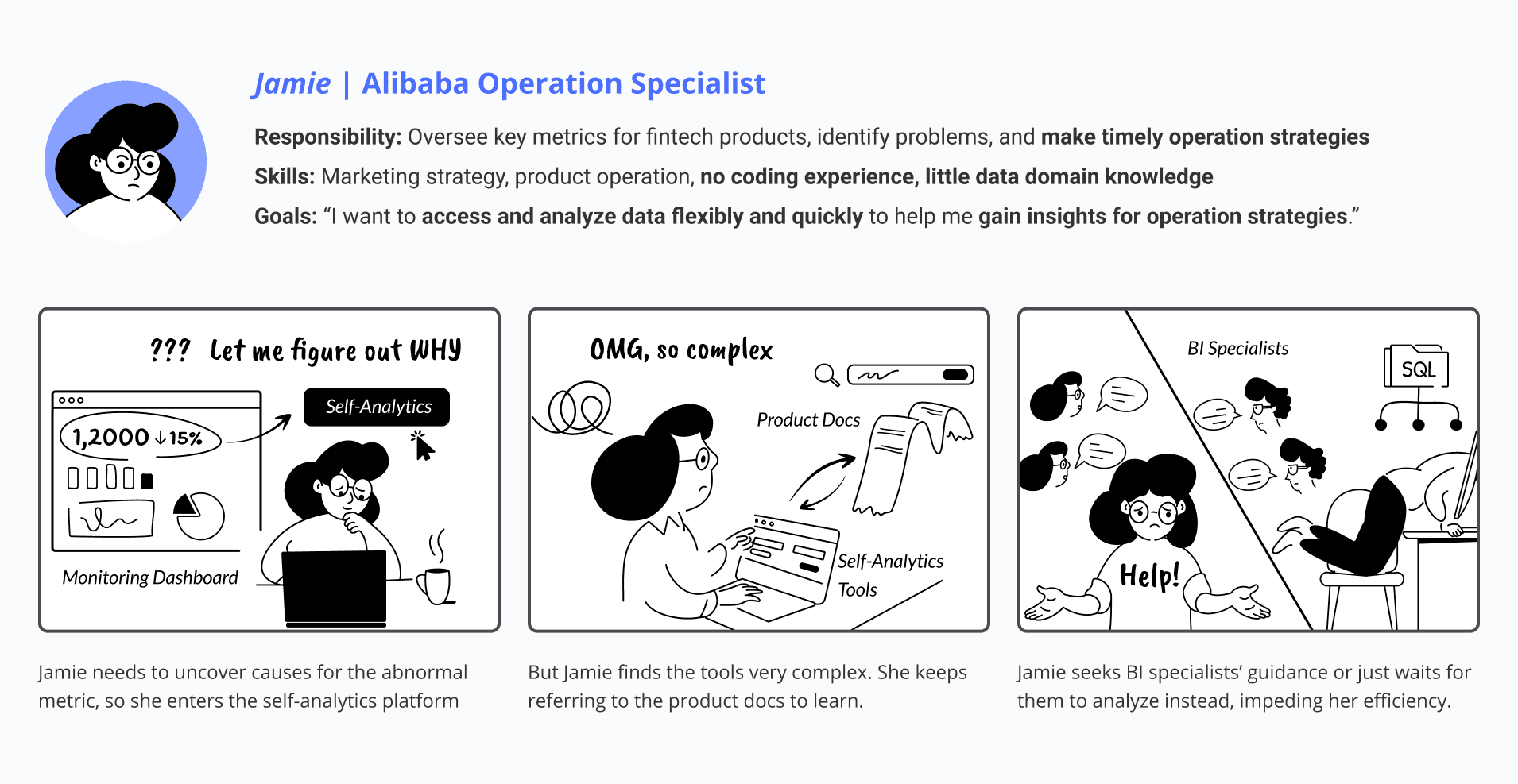
Storyboard showcasing current user pain points
design goal.
How might we help internal analysis stakeholders easily learn self-analytics tools for their needed analysis without relying on manual assistance?
initial research.
Comprehensive UX audit across 6 tools within the ecosystem
Since I was new to these tools, I started my research by talking to different product managers, conducting secondary research to understand their usage, collecting prior user feedback. This helped me gain a comprehensive view and ensure a holistic solution.

UX strategy.
💡 Leverage the most common issue to optimize effort trade-offs
My initial research revealed common features and user complaints about poor learnability across existing tools. Thus, I devised a strategy: start by establishing a benchmark with the most widely used tool (Event Analysis), then scale the design pattern across all others to enhance user experience consistently.
💡 Design for the lowest technical level to ensure accessibility
Furthermore, my research indicated that learnability issues were primarily concentrated during initial use, particularly affecting operation and marketing specialists who lack data background. To address this, I developed a strategy focused on ensuring first-time task success for data novices, so that the design can satisfy all users.

Contextual inquiry.
Following these strategies, I conducted contextual inquiries on Event Analysis, involving 8 internal operation/marketing specialists w/ little data background. As data analytics tasks are inherently linked to specific problem-solving needs in users' daily work, I tailored the testing tasks to align with typical use cases relevant to their roles.

Key findings..
issue 1.
Lack of Guidance
Don’t know which tool to use
Don't know where to start
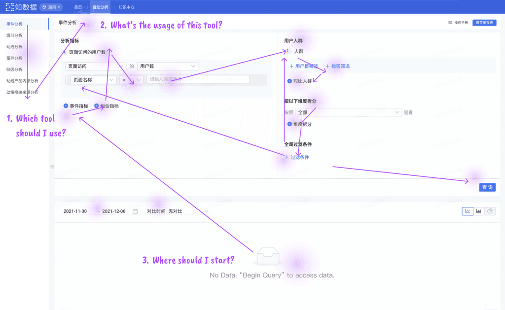
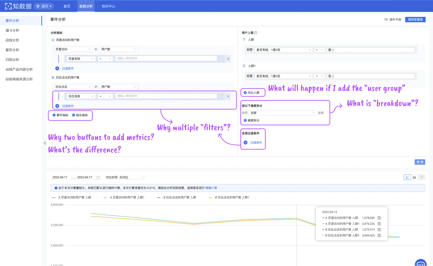
issue 2.
High Learning Cost of Data Query Configs
Complex technical terms
Scattered function entrances
Inconsistent UI design patterns
issue 3.
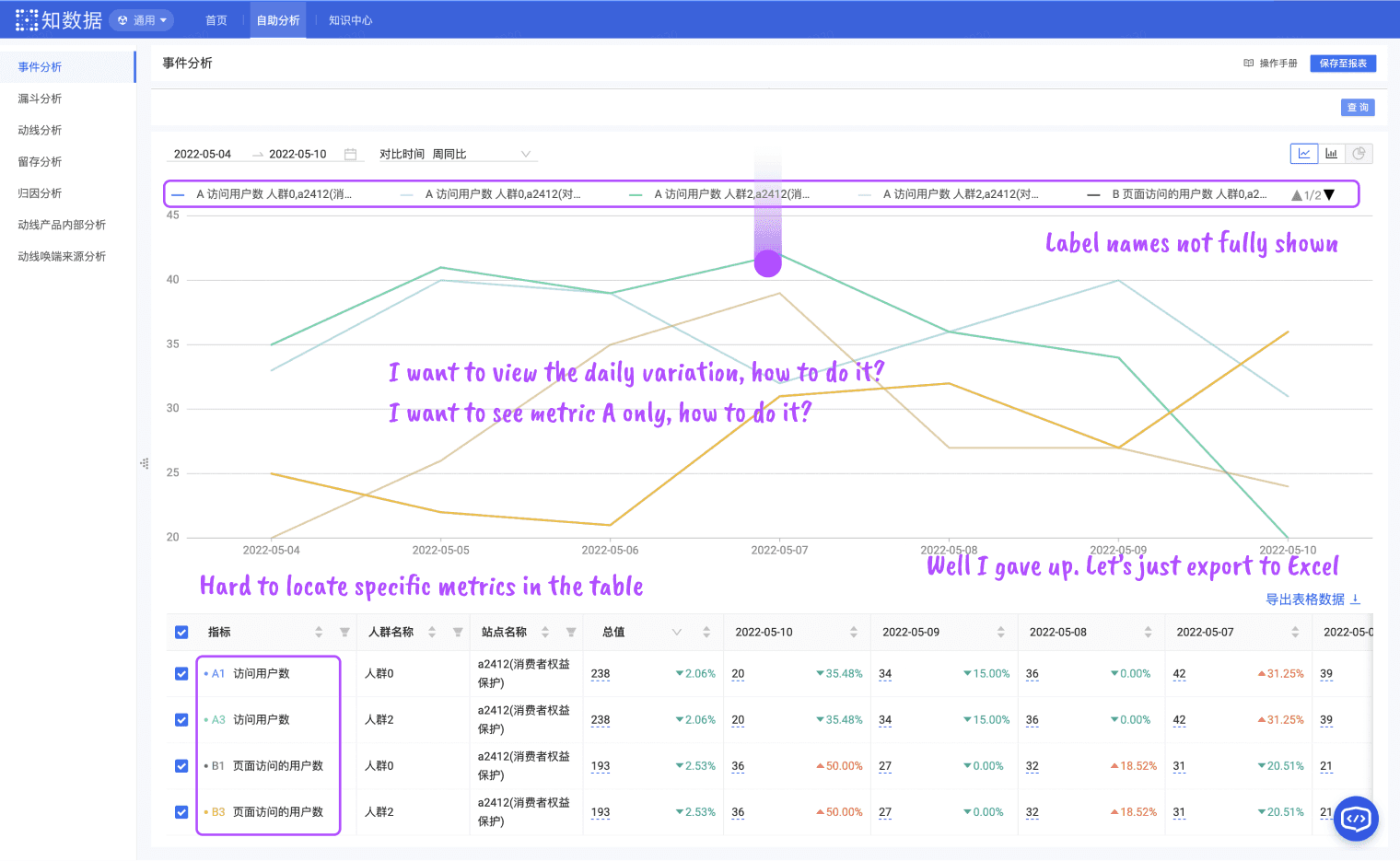
Difficulties in Visual Analytics
Unclear data visualizations
Unfamiliar with visual analytics
Team brainstorming.
Brainstorm, evaluate, and prioritize solutions
I proposed some key ideas to solve the pain points identified in user interviews and usability tests. By discussing with product managers, we further evaluated these ideas based on their impact and feasibility to determine their priority.
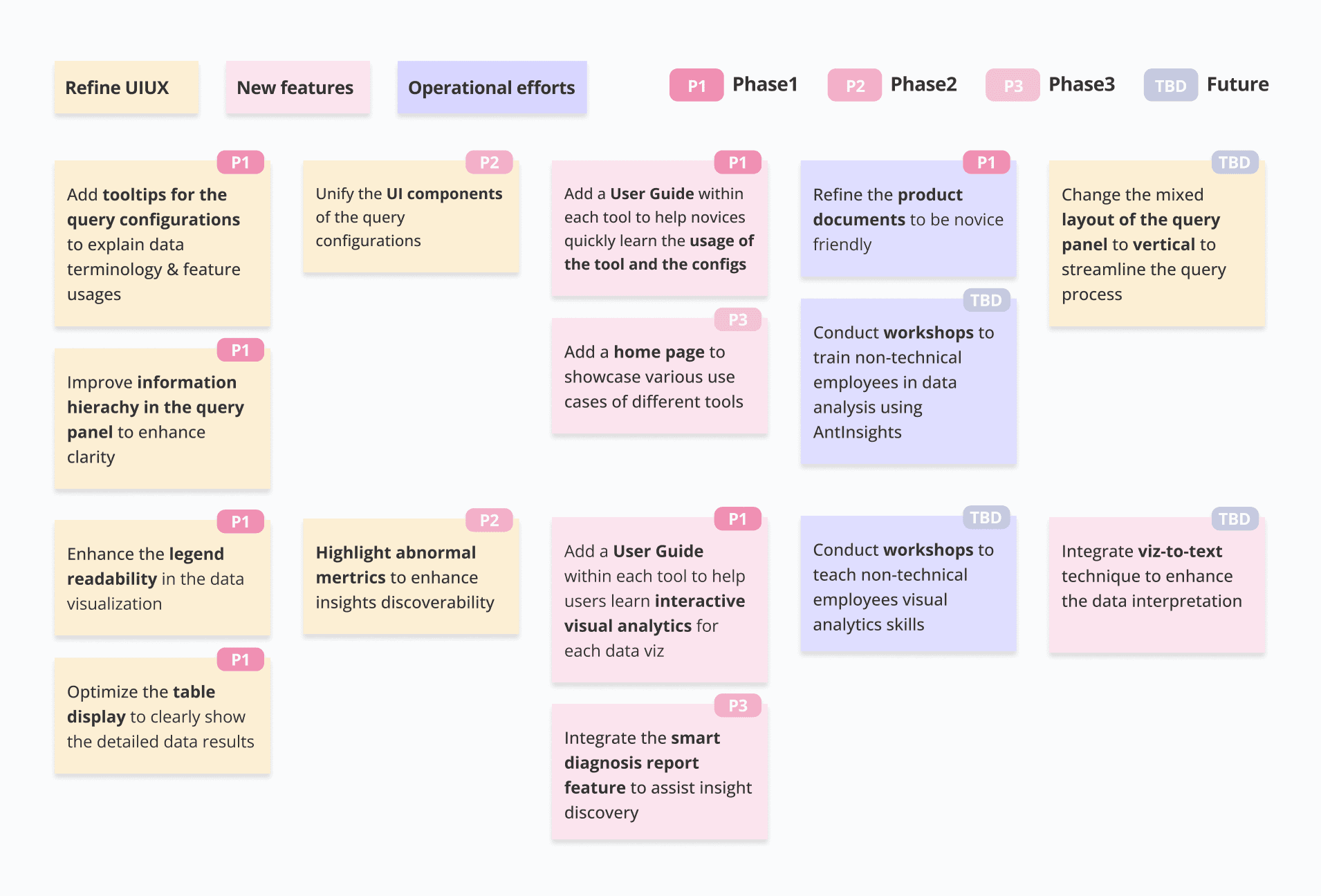
Design Roadmap.
How to balance user experience and time&resource constraints?
💡 Prioritize my short-term & long-term design goals
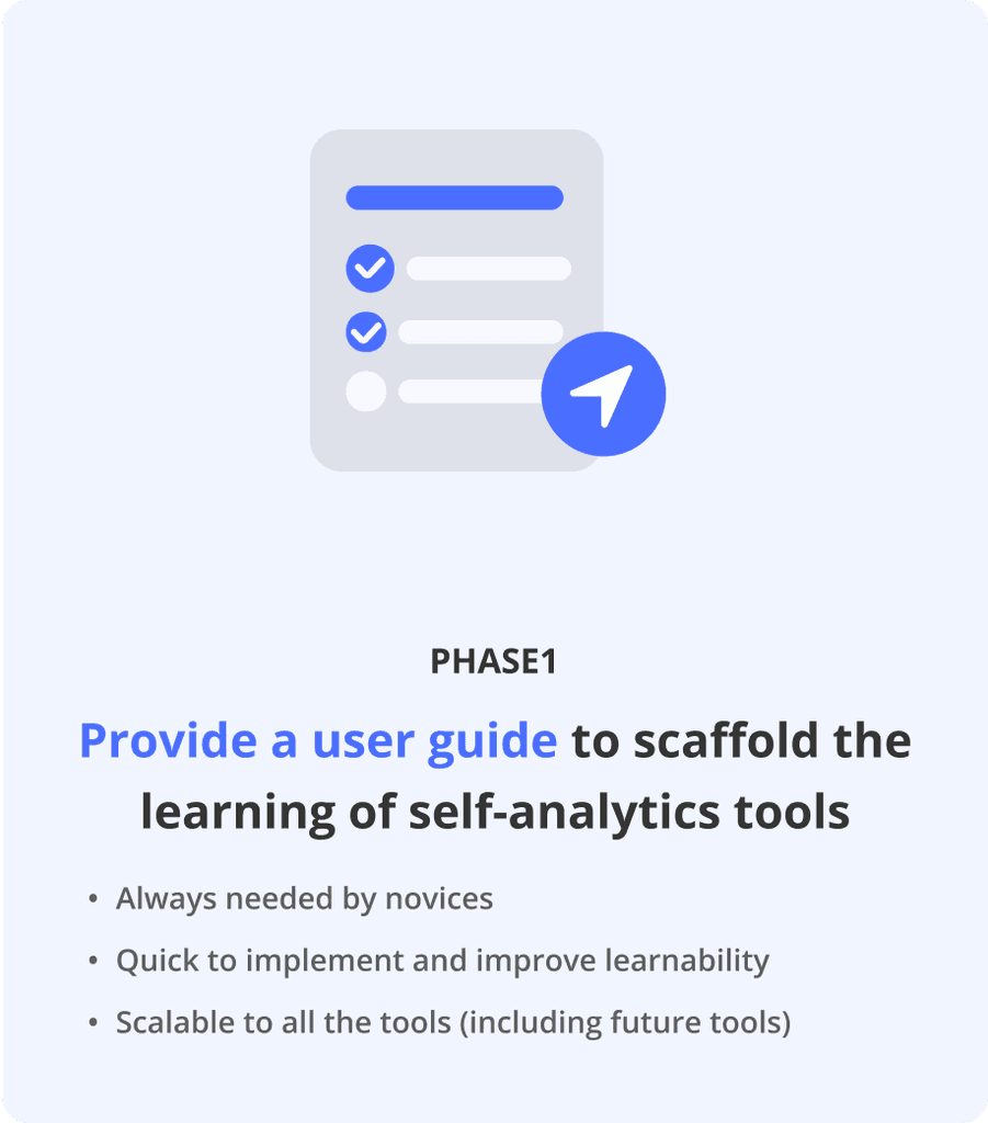
In summary, I prioritized the design of the user guide from scratch in Phase 1 for its quick implementation and significant impact on improving novices' experience. Additionally, I continuously optimized the query and visual analytics experience, which was introduced in Phase 2.

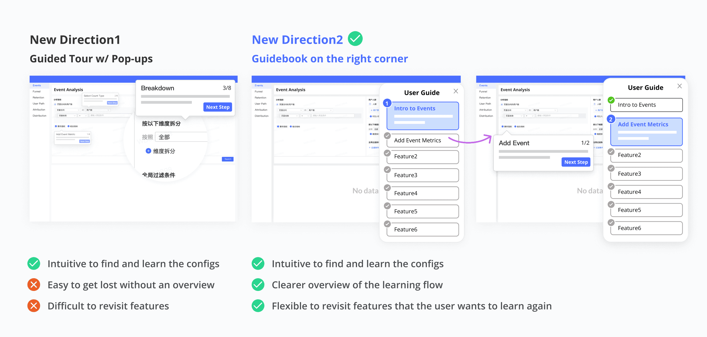
Q1: What’s novices’ desired format for the user guide?
I started with three common design patterns for the user guide and analyzed their effectiveness in the scenario of self-analytics for new, non-technical users. While these design patterns are low-cost, they couldn’t ease the learning curve effectively.

💡 A guidebook that enables novices to explore the interface while learning
Understanding the importance of well connecting the tutorial content with the actual UI, I proposed other design solutions and solicited user feedback for idea evaluation.
Learning flow.
Q2: What information do novices need to know in different steps?
I employed the mental model of novice users to guide me through the entire learning process, which served as the foundation for creating an end-to-end design for the user guide.

refine content.
Upon entry: “Where should I start?”
💡 Prompt the user guide to provide timely support
To enhance the guidance for new users, I chose the bubble prompt that notifies them about the availability of the user guide upon entry.

Before learning: “Why should I use it?”
💡 Tell users what they can do with the tool with a typical use case
Users should be informed about the purposes of the tools to choose the tool that suits their analysis needs. Currently, I have integrated tool usage information within each tool guide. In future iterations, we have planned to create a homepage that highlights the abilities and use cases of various tools, providing users with a comprehensive overview.

During learning: “Which feature should I use, where, how?”
💡 Not just explain, show it!
In my initial design, I tried to cover many features in the guide. User feedback indicated that such a lengthy guide imposed a substantial cognitive burden on newcomers, leading to reduced motivation to learn. Users also highlighted that a real-world use case could be very useful for them to understand the core features, gain hands-on experience and thus enhance the learning outcome. Therefore, I designed a typical use case to cover core features, with less frequently-used features explained as users explore the UI or refer to documentation.

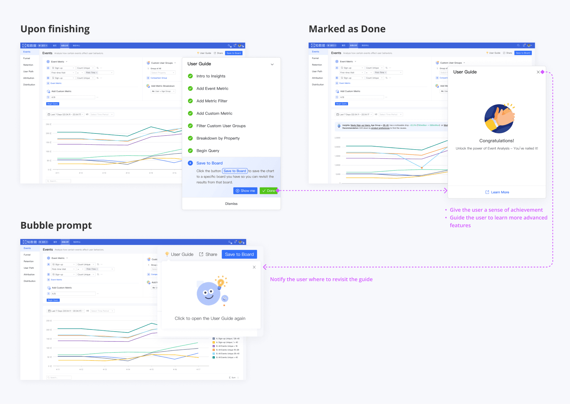
After learning: “Great! What else should I learn?”
💡 Give users a sense of achievement and guide them to learn more
Considering the novices' lack of motivation to learn new tools, it's crucial to incentivize them when they finish the learning task. Furthermore, this is a good moment to guide novices to learn advanced features not included in the user guide.
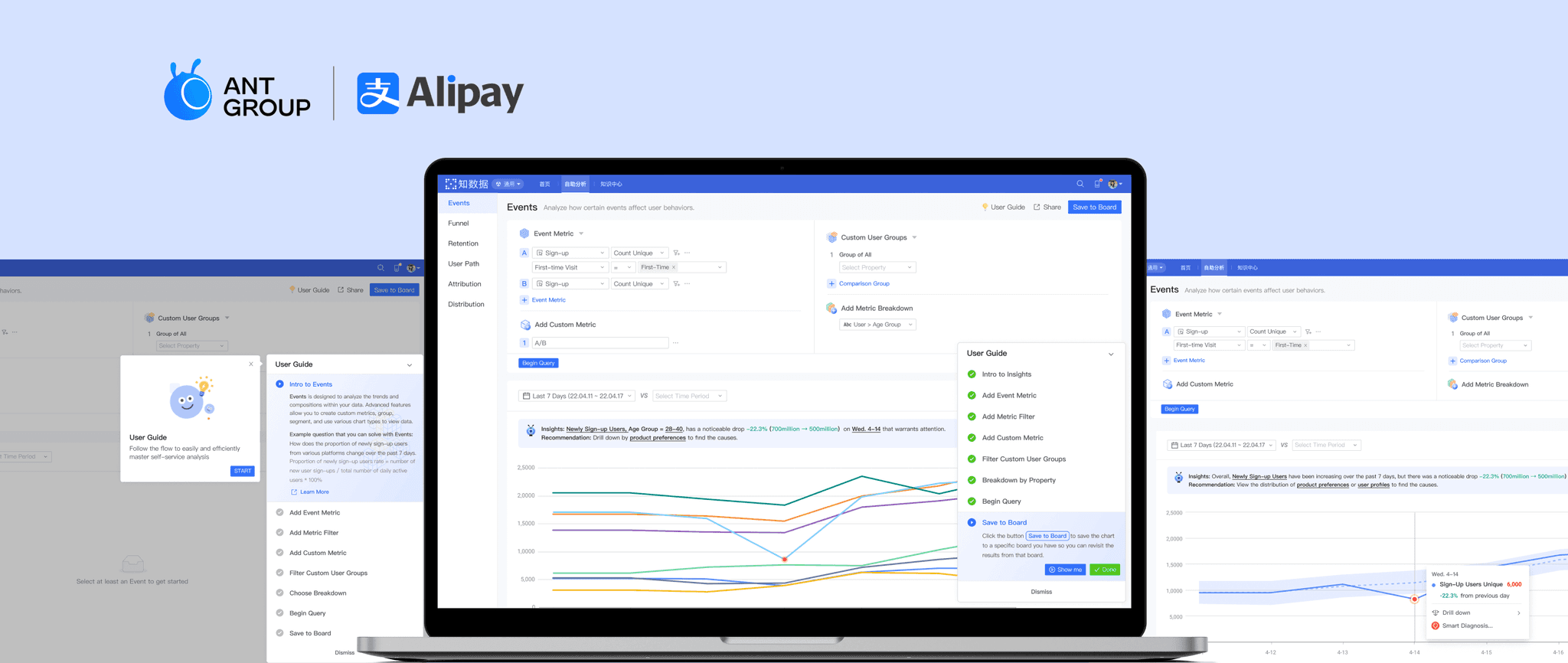
Final design.
👩🦯 User Guide: Scaffold the first-time learning experience


Gain an overview of the tutorial and the use case

Learn each feature to finish the given use case step by step

Hover the feature to easily find the relevant UI
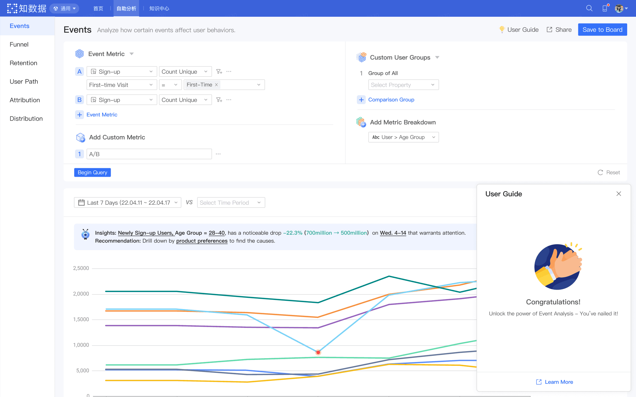
Encouraging words upon completion
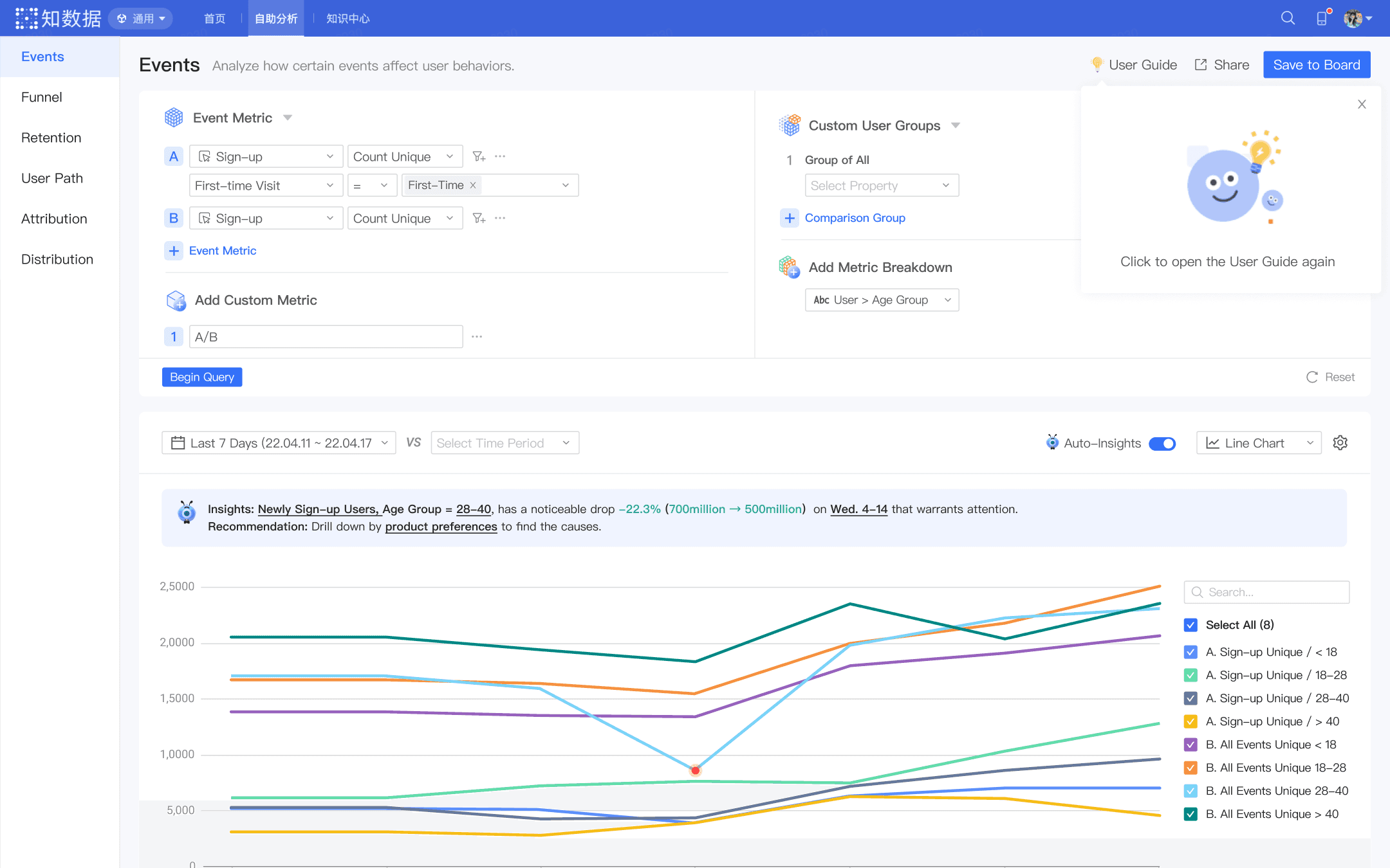
Hints for revisit the guide
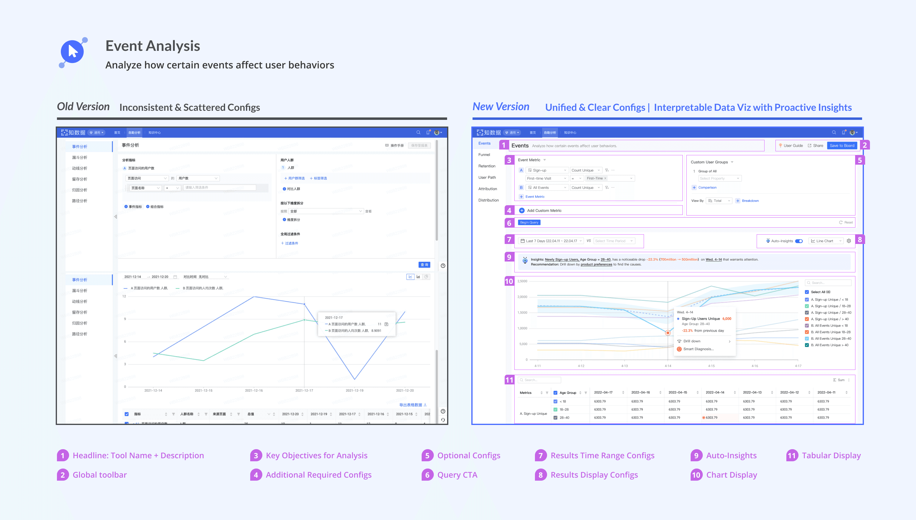
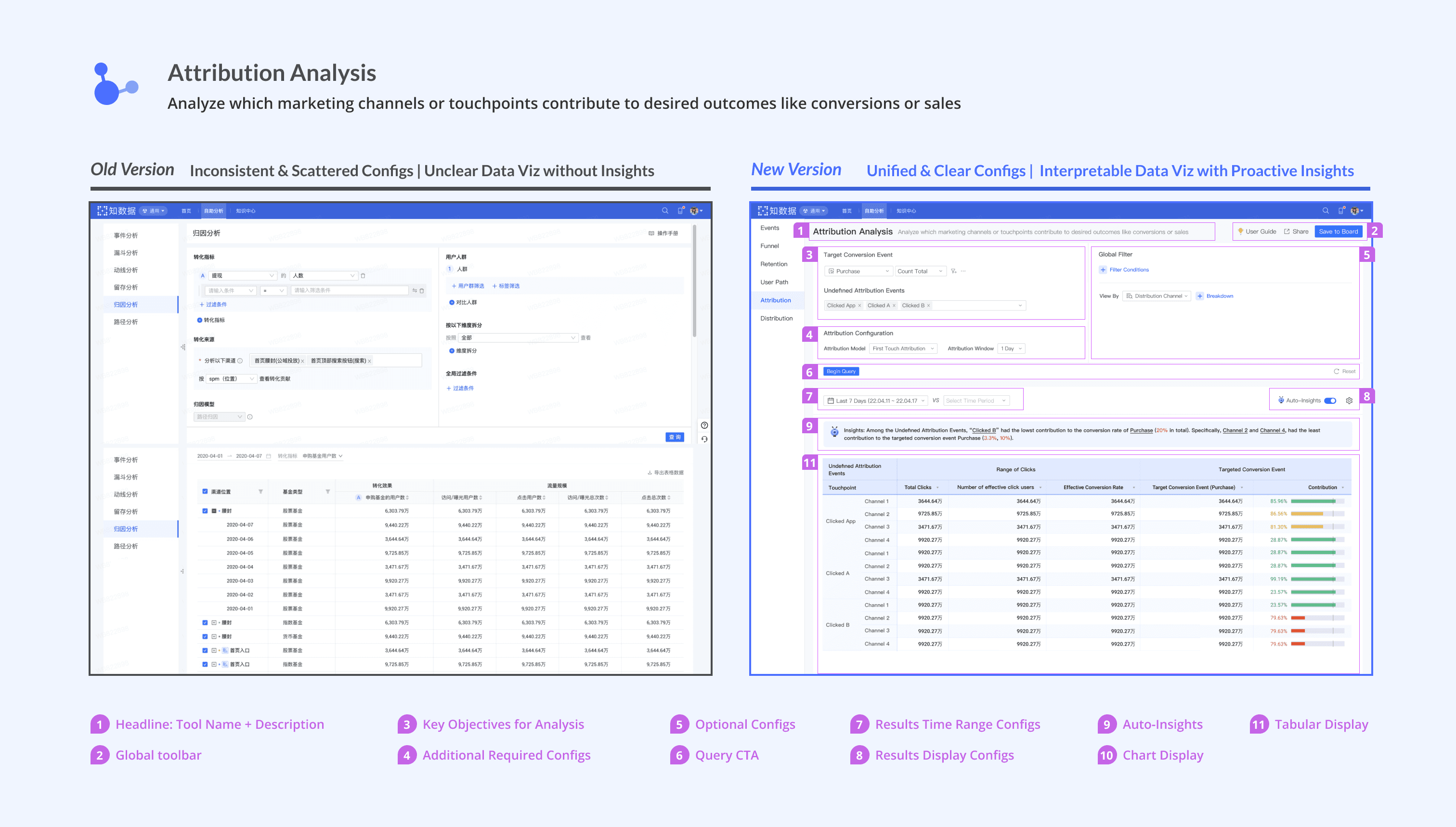
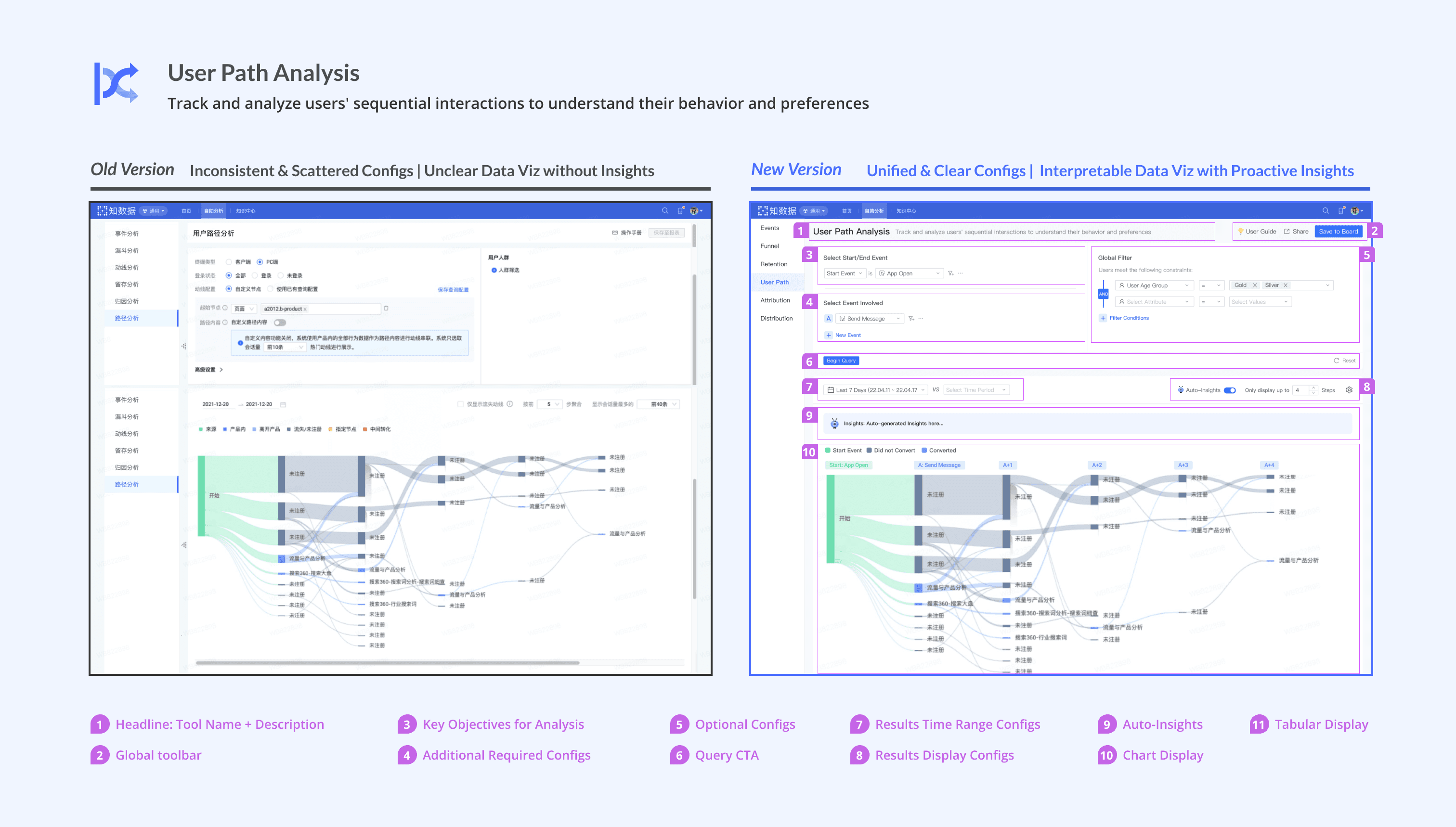
Config UI Redesign.
Q1: How to simplify complex query configs and make them more accessible for novices?

💡 Refine the information display to prioritize important configs
Since a lot of configurations are needed for data queries, to enhance information clarity and reduce novices' cognitive load, I prioritized those more important configurations using different font sizes, icons, colors.
Here I present the Event Analysis redesign as an example. The same design pattern is scaled to other tools.

Data viz redesign.
Q1: How to enhance the interpretability of data viz?
💡 More accessible data viz, more proactive insights.
I've conducted secondary research into data visualization design practices, based on which I improved the accessibility of visualizations, thereby improving data discoverability.
Furthermore, by closely collaborating with engineers, I leveraged technology insights and seamlessly integrate AI techniques to facilitate the uncovering of valuable data insights and the diagnosis of abnormal data patterns.


Final Outcome.
🥳 Scale the design approach to all the other self-analytics tools
I redesigned all the existing tools using the same design pattern, which verified the scalability of my design approach and ensured the consistency in user experience across multiple tools.

Design Guide.
🥳 Create a comprehensive design guide to ensure future consistency and streamline the design-to-implementation process
To ensure the consistency of future tools, and to help streamline the process from design to implementation, I also created the design guide that can be used for developers, design collaborators, and future designers.

Product Impact.
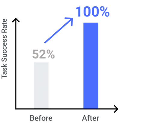
💪 Increase in First-Time Task Success Rate
The original task success rate was poor 52%. My redesign successfully helped reach 100% during the usability test, showing the great improvement in the learnability for novices.
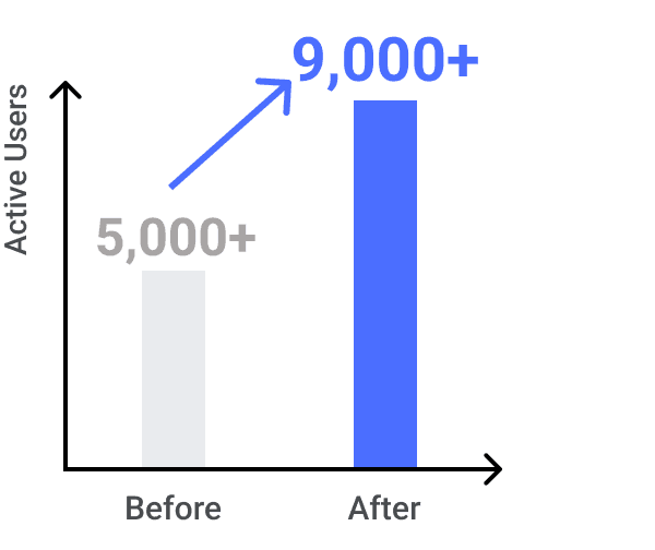
🙋🏻♀️ Increase in User Adoption
Our redesign drove the successful increase in user adoption, growing from 5,000+ to 9,000+ users within 2 quarters after launch!
Team Feedback.
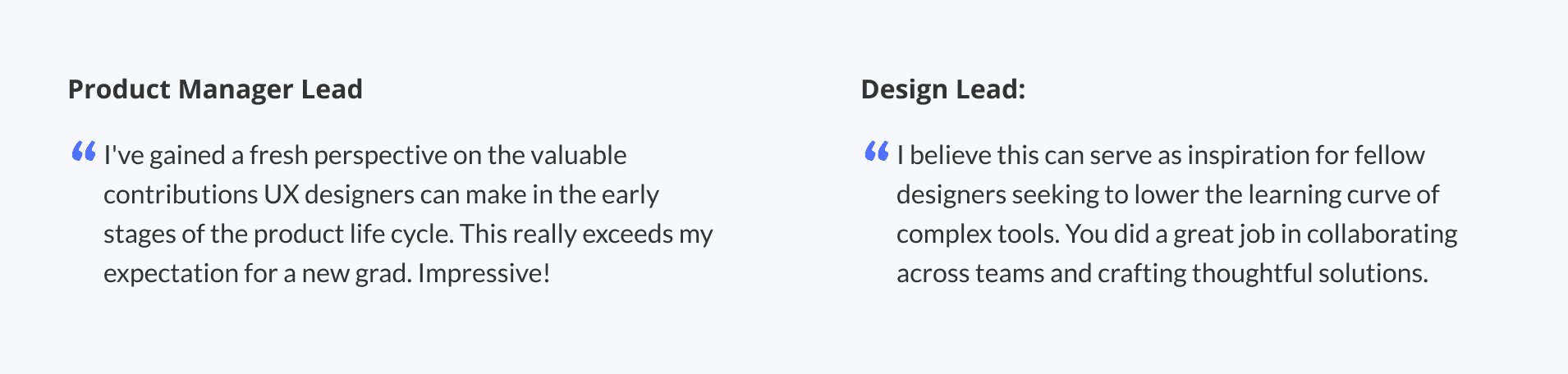
🫶 Warm recognition by team members
What I learned.
🎯 Create design strategy to "breakdown" the complex problem
While the initial scope - redesign of the 6 tools, is broad, I've learned to refine the product focus and develop my design strategy by prioritizing user needs while keeping business goals and the timeline in mind. Going wide to find common issues across different tools and then digging deeper into the most severe user pain points, I was able to navigate through ambiguity and identify my design focus. It's essential to aim for a holistic solution, but it's equally crucial to break down the overarching problem into manageable sub-issues.
👫 Proactively seek advice from stakeholders
Collaborating in an interdisciplinary environment, I learned that a well-operated product is more than the design of interfaces or interactions, but a collaborative work of different roles. To facilitate cross-team collaboration, designers should actively seek input from different stakeholders and incorporating diverse perspectives. In this project, collaborating with BI specialists informed the design of tutorial content, working alongside engineers enabled the integration of technology insights for innovative features like 'auto-insights' and 'smart diagnosis,' and consultations with product managers facilitated the creation of strategic designs. I am excited about wearing different hats in the future, by proactively seeking input from different stakeholders.
👀️ User-oriented language instead of object-oriented language
When dealing with abstract terminology and complex domains in the tool design, it's common for designers to design from a technical, 'object-oriented' perspective. However, I believe that the language of elegant design should mirror human communication, being intuitive to learn and adopt. The lesson I learned was to first digest abstract technical knowledge, and then revisit it from a non-technical, new user's perspective, which includes collecting use cases, building conceptual models, and finding familiar metaphors for users.
Want to learn more about my work experience at Ant Group? Check it out!