
Ant Design team
@ Ant Group, Alibaba
Software Engineers
Quick Glance 👉
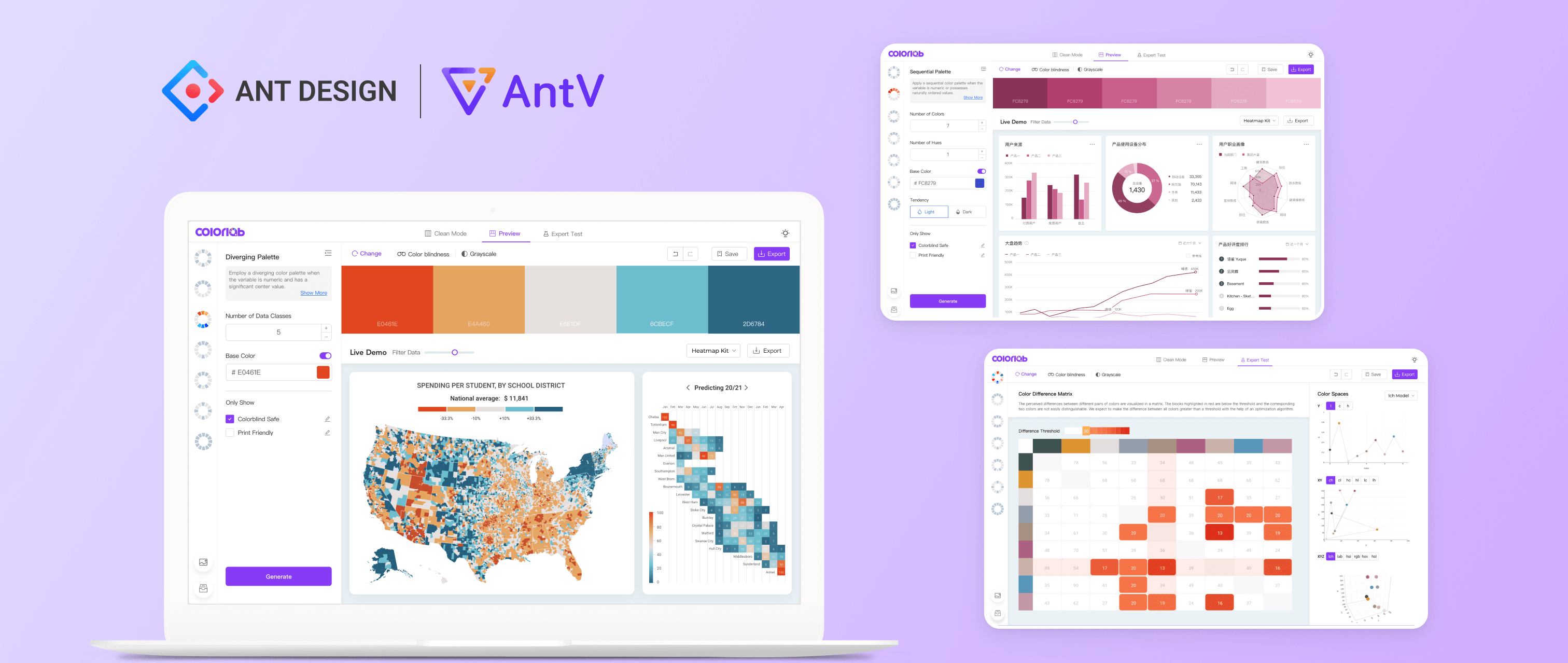
I interned as a UX designer at Ant Design team, Alibaba, focusing on the design of visual analytics platforms and China's premier open-source data visualization library AntV.
Recognizing challenges in tailoring palettes for diverse applications among my colleagues (UX designers, visual designers, business intelligence), I initiated "ColorLab" as my side project to facilitate the design cycle. After pitching my idea to Ant Design team, I led research and design, closely collaborated with engineers to tackle the technical challenges, and successfully launched the 'ColorLab' web app internally. It garnered enthusiastic feedback from 300+ users, enhancing satisfaction and efficiency in data viz palette production. 🎉
Key abilities:
Product Opportunity Identification
Job-to-be-Done
Accessible Design
Innovative Design-Tech Fusion
Problem.
Secondary Research.
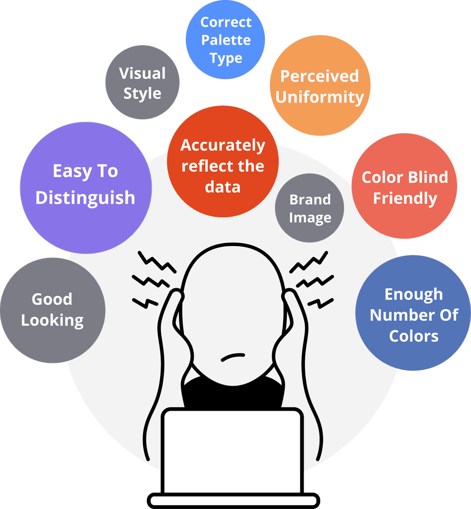
Online palettes fall short in meeting the demanding requirements of data viz palettes
My initial questions were: What are special requirements for data viz palettes? Why users can’t simply use online color palettes for their data visualizations? Thus, I conducted desktop research and identifies the reasons behind:

To sum up, professional visualization palettes have high requirements for accessibility, scalability, discernibility, etc., in addition to aesthetic quality. However, most online palettes do not satisfy such multifaceted requirements. Many of them are either not accessible, or do not meet user customization requirements, making additional fine-tune necessary.
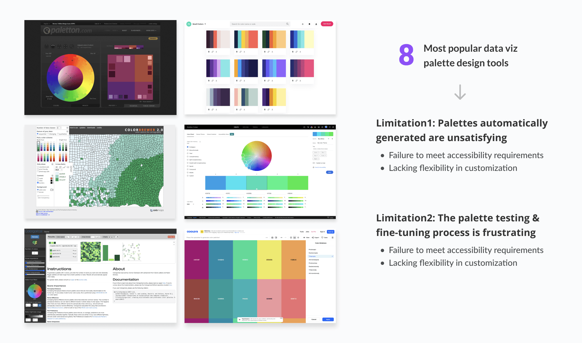
Competitive Analysis.
Existing palette generation tools also fail to meet multifaceted requirements
To understand why it’s also time-consuming to create palettes with many existing palette generation tools, I did competitive analysis of well-known generation tools. It turned out that there is also a gap between expected palette quality & user experience and the features offered by existing tools, resulting in a challenging and frustrating palette creation process.
User Interviews.
Understand user voices
I conducted user interviews with colleagues with different backgrounds, and different uses for visualization palettes. In this way I was able to collect and analyze quotes from different types of potential users.

User Personas.
2 personas: Distinct needs from amateur users and expert users
Through synthesis, I classified the target users into 2 personas based on their expertise in data visualization design and their usage scenarios: One is designers with expert data visualization knowledge, and the other one is BI or general UX/visual designer, who have limited knowledge about data visualizations. These personas helped me cater to both expert and non-expert users.

Job to be Done.
Understand the palette design workflow using Job-to-be-done
To understand the user flow, goals, tasks, and existing challenges, I synthesized user interview findings using Job-to-be-done.

Key Finding: Users frequently jump back and forth between different stages and tasks, resulting in frustration and low efficiency.
Key Obstacles.
3 Key obstacles behind the hybrid user flow
I also identified 3 causes behind the hybrid user flow. All these frictions need to be addressed to streamline the palette design process and ensure satisfying outcome.

How might we facilitate the palette design process?
I then proposed 3 design opportunities based on the obstacles identified in previous research.

Smooth: Streamline the hybrid design workflow with 1 platform
To reduce frictions caused by frequent switches across platforms, I streamlined the end-to-end palette design process incorporating the key stages identified in Job-to-be-done.
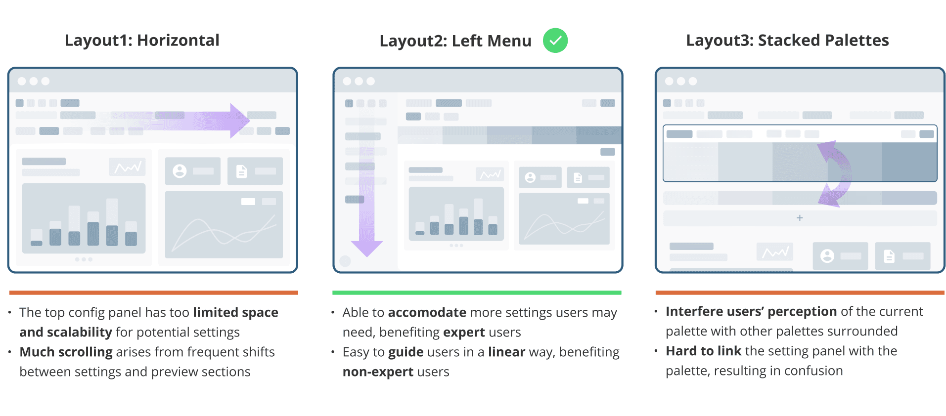
Intuitive: Define the suitable layout for palette design
To figure out which layout can help users intuitively perceive the actual palette performance and evaluate its usability, I explored different layout designs. I created mid-fi prototypes and solicited feedback from target users and experienced designers.

Based on the feedback from experts and target users, I decided to choose Layout2, which was proved to has more scalability in the palette configs and is intuitive in evaluating the palette performance.
Confident: Clearly reveal color deficiencies and intelligently optimize
Accessibility tests help people easily identify the issues with their palettes. I collaborated with engineers in investigating technical solutions for diverse accessibility tests, including color blindness, dark mode, etc.
However, I noticed a significant gap in existing tools: the absence of a color discriminability test. Making sure each pair of colors are distinguishable is vital to data visualization palettes, as different colors in the visualizations have different meanings. However, even visual designers often encounter challenges in discerning if color pairs are too similar, particularly when dealing with palettes with more than four colors. One idea came to my mind:
Could color discriminability be "quantified" and intelligently improved using computational methods rather than relying solely on human perception?
Driven by curiosity and eager to enhance the accessibility during palette optimization, I conducted desktop research, from which I learned algorithms that could calculate the color difference, which could accurately reflect how different two colors look like.
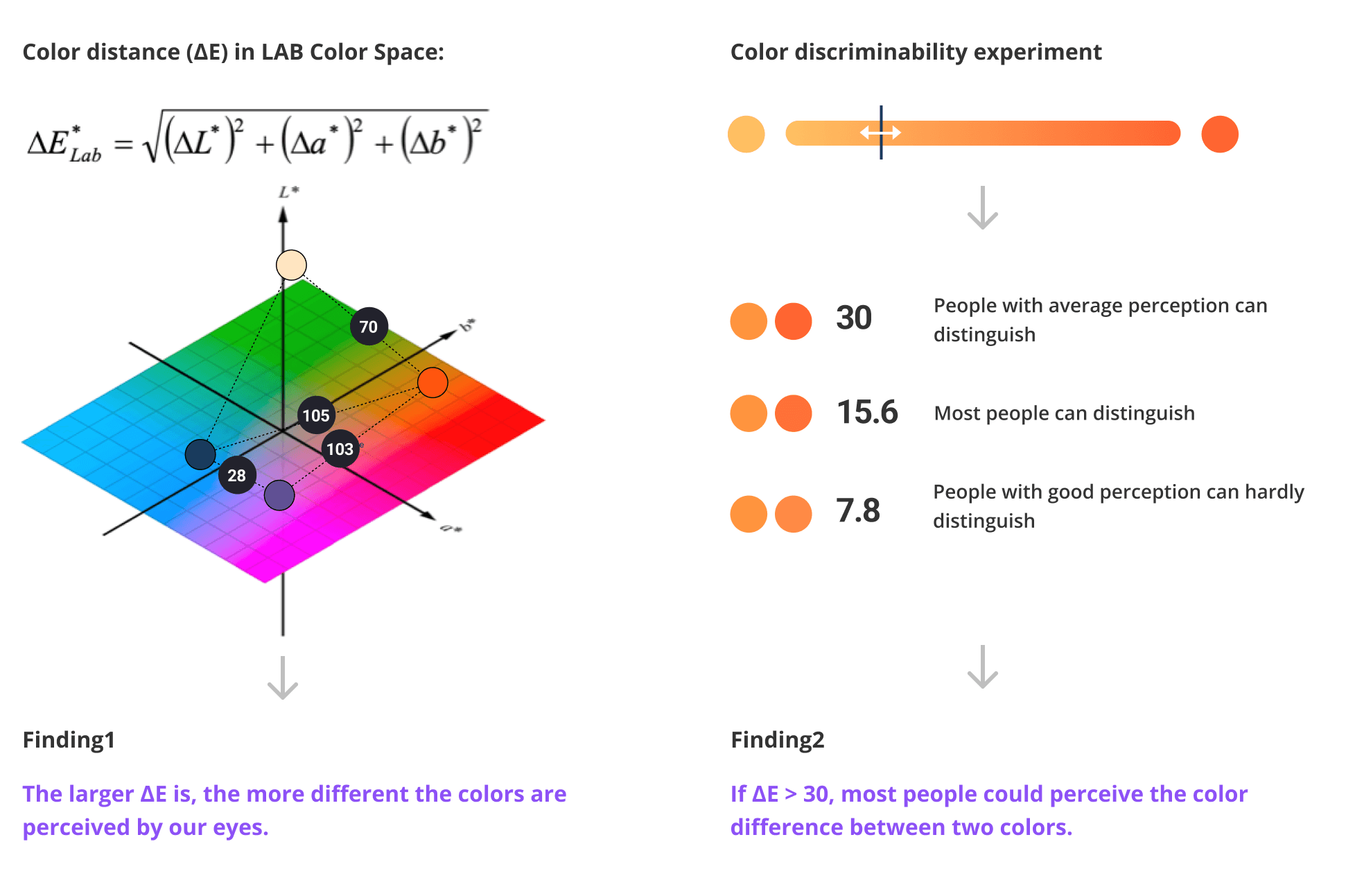
💡 A “Color Distance Matrix” for color discriminability test

Logo Design.

Final Design.
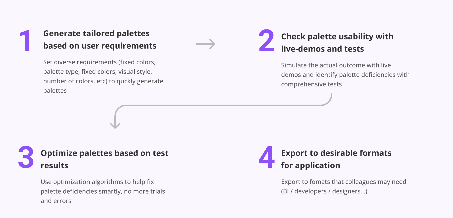
Step1
Palette Generation
Usage Scenario: Users have multifaceted requirements for data viz palettes, e.g., visual style, branding colors, palette type, etc.
😭 Before: Do not provide enough configs or the configs are too technical for non-expert users.
😄 After: With the intuitive configs, users can now customize such requirements and generate palettes quickly.


Step2.1
Evaluation w/ Live demos
Usage Scenario: Users need to evaluate the usability of the palettes within an actual application or a similar one.
😭 Before: Hard to imagine actual performance
😄 After: Recommend diverse live demos for simulation; Support customizations like the data quantity for better simulation.

Step2.2
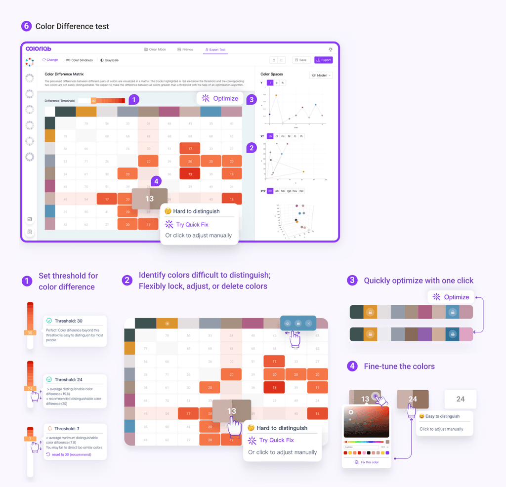
Evaluation on Accessibility
Usage Scenario: Users need to evaluate the usability of the palettes through accessibility tests, including the color blind friendliness, usability in the dark mode, color discriminability, etc.
😭 Before: Users need to switch between different platforms to test the accessibility. Also, many tests are not user friendly for non-expert users.
😄 After: Provide intuitive and comprehensive tests in one tool, including a special color discriminability test that makes it easy for anyone to identify similar colors at a glance.

Step3
Optimization
Usage Scenario: Users need to fix the deficiencies identified in the tests to improve the palette's usability.
😭 Before: Users rely on personal perception to fine-tune the colors, which involve time-consuming trials and errors, and is full of uncertainty.
😄 After: Users can quickly optimize the palettes with the assistance of smart optimization features. Besides, users have the flexibility to lock colors that they don't want to change or just optimize specified colors.

Step4
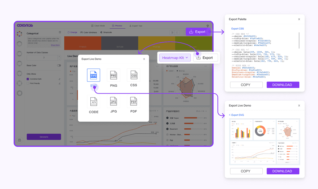
Export to Use
Usage Scenario: Users need to export the palette and apply it to their applications, e.g., the dashboard, design files, etc.
😭 Before: Existing tools may not provide enough formats users may need.
😄 After: Export to a desirable format with one click, facilitating the application of the palette & the live demo.
Product Launch.
🎉 300+ new users provided positive feedback
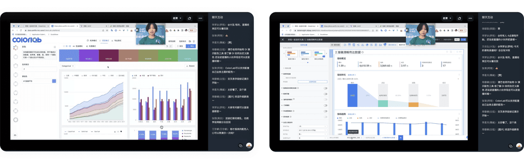
I closely collaborated with engineers to launch Colorlab in Ant Group, Alibaba. Attracted 300+ users after the first launch, who provided very positive feedback for improved palette quality and design efficiency.
Product pitch.
💗 200+ audience attended my online workshop on data viz palette design
I delivered a talk on "Creating a Beautiful and Effective Visualization Palette for Your Report" and introduced ColorLab. Over 200 attendees were present, and the feedback was quite positive. 👉 Slides (in Chinese)
What I learned.
🧣 Tackle accessibility issues: Everyone can be disabled
Our perceptual abilities vary among individuals, with some being able to distinguish colors more easily than others. As designers, it is our responsibility to adopt an inclusive design process that recognizes and considers the needs of excluded communities from the early stages of design. With a firm belief that everyone should have equal and convenient access to perceiving the world, I aspire to use my design skills to enhance people's abilities and bridge the gap created by innate differences in perceptual abilities.
👒🎓 Design for both amateur and expert users
To effectively design for both amateur and expert users, it's essential to recognize that they possess different levels of mental models and expertise. Conducting user research to understand their shared and unique requirements and pain points is crucial. Familiar design patterns and terminology should be used instead of unfamiliar user interfaces or technical terms that may be unfamiliar to amateur users.
🍻 Learn from non-designers
I closely collaborated with developers in this project throughout the design process, engaging them to propose their suggestions and ideas. Such cross-boundary helps generate exciting ideas like the color difference visualization and optimization. Also, I learned from developers to take the technical costs and feasibility into my design considerations. Moreover, I learned from some experienced product managers of how to use MVPs to quickly test my design and iterate my design based on user feedback.
Want to learn more about my work experience at Ant Group? Check it out!